About
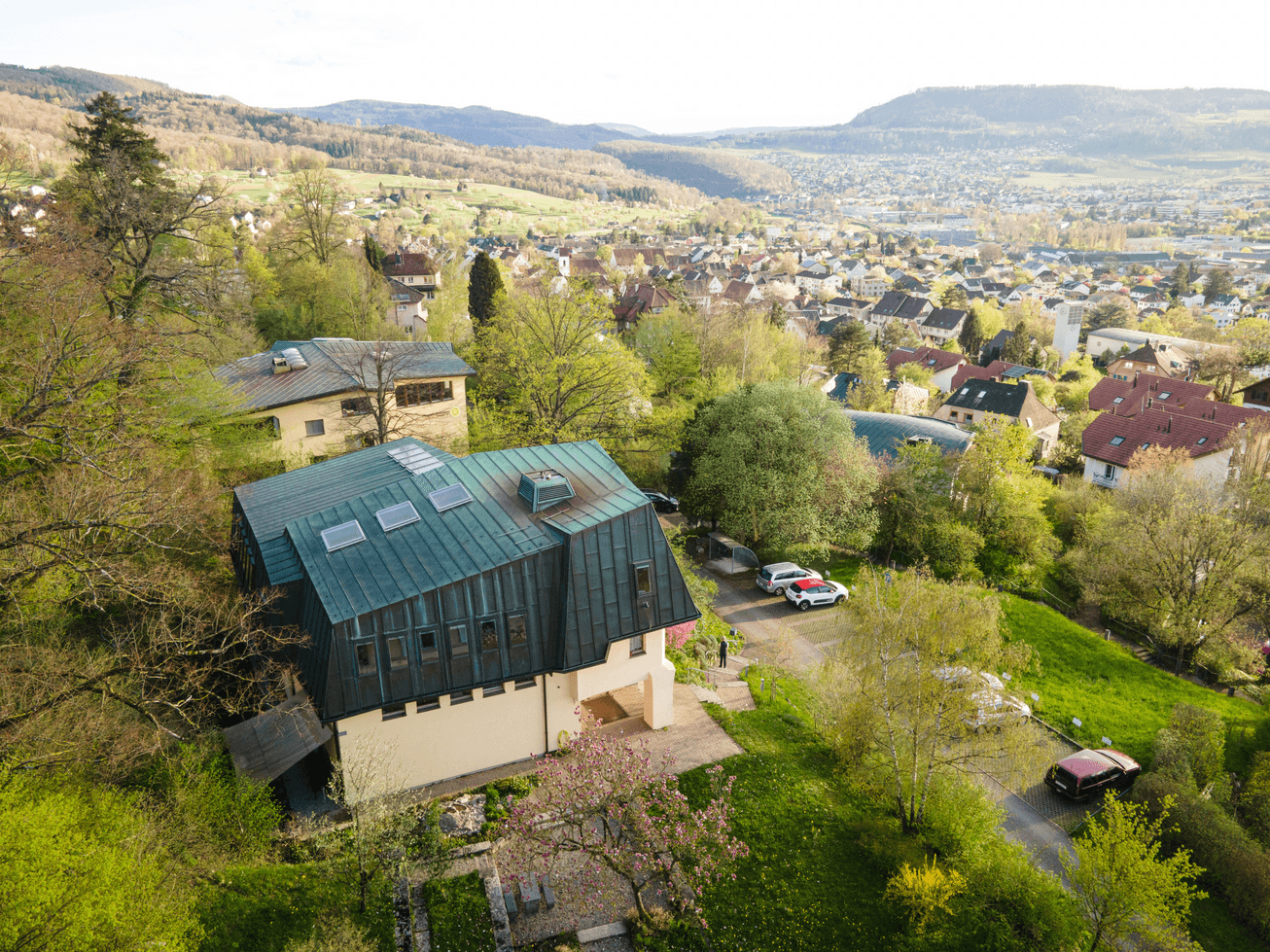
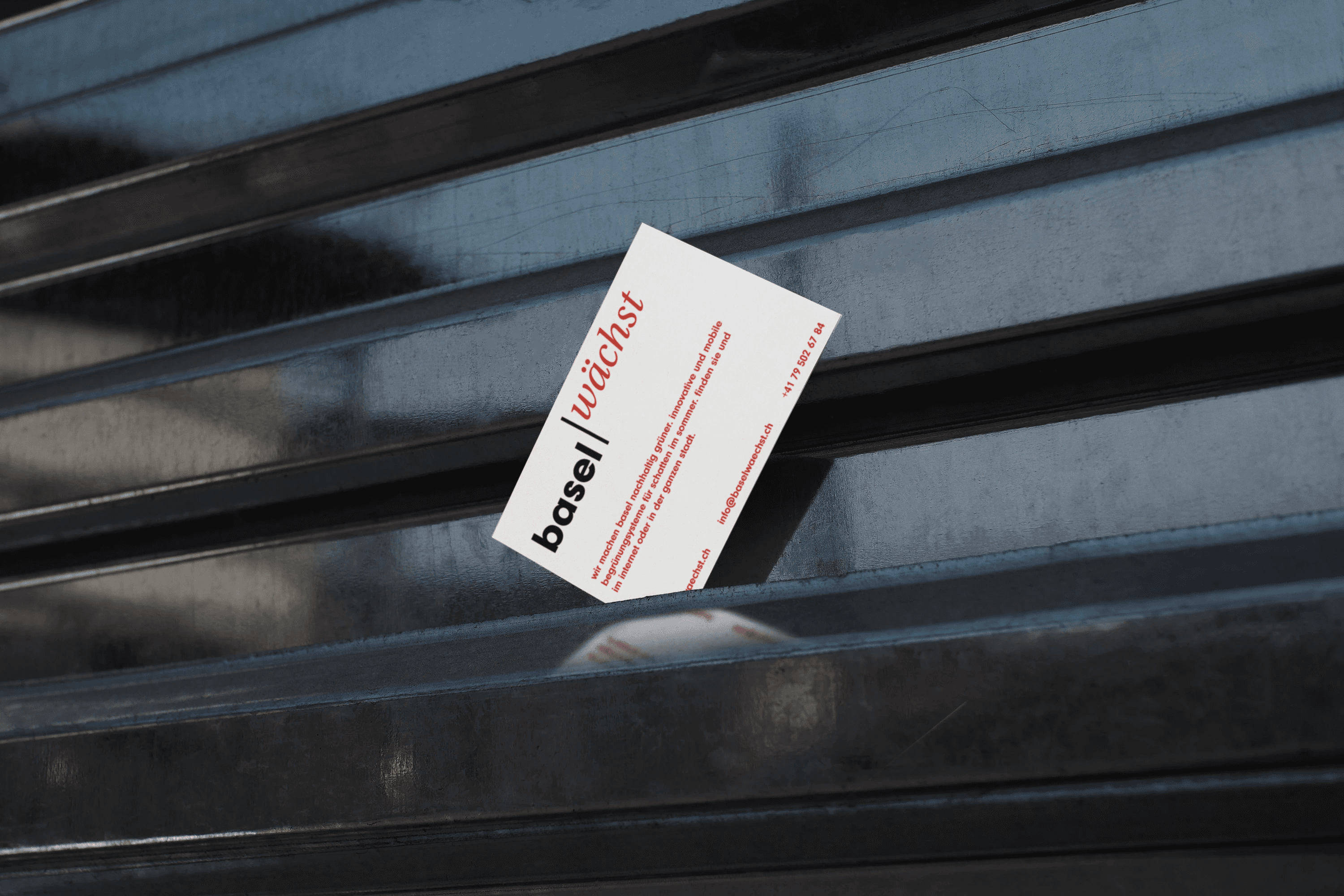
For the ZHAW project "Basel Wächst" (Basel Grows), we developed an independent brand identity that makes the greening initiative visible and involves both the urban community and experts. We designed a logo that captures the idea of growth and gives the project a distinctive identity. In addition, we created a website that provides information about events and serves as a central platform to promote exchange between experts, urban planners, and interested parties.
Client
ZHAW
Category
Urban greening
Year
2023

Shooting N° 2
During the second shoot with Five SkinCare, the focus was entirely on the products themselves, without the use of models. The goal was to replace rendered product images with real photos in order to achieve greater credibility and a more natural brand perception.
Red
White
Black
Typografie
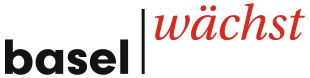
Das Erscheinungsbild von «Basel wächst» kombiniert zwei gegensätzliche Schriftstile: eine klare, geometrische Grotesk für «basel» und eine kursive Serifenschrift für «wächst». Diese Verbindung aus Präzision und feinem Schwung macht den Auftritt strukturiert und zugänglich zugleich. Im Logo werden beide Wortteile durch einen schmalen vertikalen Strich getrennt und in versetzten Höhen zueinander gesetzt, inspiriert von schattenspendenden Begrünungsboxen, wodurch der Gedanke der Initiative bereits in der Form des Logos mitschwingt.
Neuzeit Grotesk
Aa
Gg
Ff
ABCDEFGHIJKLMNOPQRSTUVWXYZabcdefchijklmnopqrstuvwxyz0123456789?!.,;«»+=*#
Aa
Gg
Ff
ABCDEFGHIJKLMNOPQRSTUVWXYZabcdefchijklmnopqrstuvwxyz0123456789?!.,;«»+=*#



More projects